Herb Sundays 107: Ian Anderson (The Designers Republic)
The influential designer shares a 6 day, 2000+ song studio playlist.
Herb Sundays 107: Ian Anderson (The Designers Republic) (Apple, Spotify).
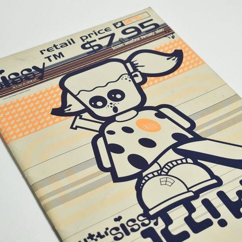
Art by Michael Cina
“Essentially I made the playlist for me… to play in TDR™. There’s no hierarchy, no best of... it’s just music played in the studio in 2023 to work to. It’s a curated and programmed mash up of old favourites, current obsessions and future facinations. It’s a 2,023 track Polluted Rockers selectah all the way. It sounds best if Spotify playback settings are set to 10 seconds crossfade. To hell with purity!” - Ian Anderson
The mid-late '90s, from my North American purview, began a renewed interest in design as a noun, or as something we could all remark on. A personal miscellany: In 1994, Tom Ford stepped into the creative director role at a floundering Gucci and found fame the following year with his ‘70s-inspired looks, a rarity for an American fashion designer. The UK's Wallpaper* magazine started in 1996 and became a global phenomenon, a big blocky ad-rich chunk of photos that quasi-normalized the idea that you maybe needed a Philippe Starck lemon squeezer for your morning OJ in your spare, Mid-Century adorned loft. Steve Jobs returned to Apple in 1997 which begat The iMac G3 (the colorful one) in 1998 where YOU the consumer got to choose your color (from a small group). Indeed, the idea of democratic design was afoot in time for a new millennium, an optimistic futurism we hadn't seen since the early '80s. The edge of the 2000s saw industrial designers like Marc Newson and Karim Rashid publish monographs and show up in business magazines as feted archetypes alongside the further anointing of "new media" as a catchall industry to support the burgeoning commercial web, where the title of Graphic Designer became a chic job.

Growth industries need heroes and role models; and a misfit design shop of out Sheffield would provide ample influence. Heady and subversive enough for academic circles like font foundry Emigre, but commercial enough for brands like Coca-Cola to get involved, The Designers Republic (tDR) (founded 1986, Ian Anderson & Nick Philips) would affect an impact on graphics not dissimilar to Nirvana on popular music at the top of the decade, a show of force that underground could be mainstream, both subversive and seductive, no-sell-out but flash.
Indeed, the primal fear of Gen X was to be eaten up by the Corporation and to lose one’s would-be heroic virtues. This apparent tension of the '90s, between Young and Old, and Man vs The Man, was moving to an uncertain end, what with the ennui of Generation X (1991) fanning the flames of a final gasp of the postmodern (Infinite Jest (1996), or so I’ve heard) which then would turn more fearful, moralist, and rigid with Metamorphic parables like Fight Club (1996 novel, 1999 film), OK Computer (1997) and No Logo (1999).
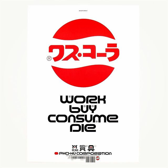
To arm ourselves in the irony of the era, but with the pleasure principle of Cool Britannia and American Frutopian Lollapaloozian faux hippie idealism, we would need imagery that captured and luxuriated in this excess but cast a scornful gaze. No one captured the steely corporata of the late era like tDR, all excessive ©s and ™s and crisp Helvetica as factory preset, while cosplaying as a big company but with the spirit of a loudmouth, socialist Krang in its belly. The “Work Buy Consume Die" slogan was a perfect epitaph for the times, and the work that came out of tDR acted as both a send-up of and a love letter to the warped plastic world that we would acquiesce to (PC Music, et al.) in the 2000s and beyond.
None of the above is anything Ian Anderson has said or made reference to in the making of his firm. This is just my recollection of how their work hit my windscreen. Indeed my understanding of graphic design was pretty nil as a teen, and like most people my age, CD and record sleeves served as my education. I knew who Peter Saville was, vaguely, as my favorite sleeve ever was/is New Order’s Substance (1987) thanks to my sister’s cassette copy, but I didn’t know that I was experiencing the font majesty of Bodoni (who got a piece in today’s paper coincidentally), a real post-mod humdinger, a double indemnity. I also knew that 4AD had historically great graphics, but they felt more like dioramas or miniature film sets, more Secret of NIMH than the high street. Luckily when I got to college and learned more, thanks to people like Will Calcutt (Herb 69), who later tipped me to the work of our beloved Herb Michael Cina, is where I started to understand what graphics were.
Maybe because the music I liked most growing up, Hip-Hop and Electronic(a), were so entwined with graphics, that to this day I still get a similar rush to seeing a wonderful image as I do hearing a great song. When fused together, it is even better. Warp Records, the greatest Electronic label of all time (though they are post-genre now, aren’t we all) set the standard for fit and finish, and usually their best stuff laddered back up to their Sheffield neighbors, tDR at the visual helm.
The connection between musician and graphic is also a metaphor for the band-like quality of tDR in that era. Indeed, while Anderson has always at the helm, that era of tDR was indeed a crew, and it was a collective energy and skill that made the work sing, helping foster some of the best talents of the age in designers like Michael C Place (Build), Matt Pyke (Universal Everything) and many others.
The best of their apparently 3500 sleeves, work on an emotional level, again sort of like a song, but Anderson insists it’s all in the ideas. A real brainsmoker for me was 1999’s jacket for Funkstörung’s remix compilation, Additional Productions. The booklet is a replica of the corporate identity manuals that would become popular as crowdfunded coffee table books in recent decades, including livery, Pantone registrations, and would-be uniforms. It’s enough to make you sick to your stomach.

The Designers Republic was also a travelogue, seeking the GLOBAL in the era before Lost In Translation (2003), another foundational Gen X text. The willingness to riff on Japanese design with a strange mutant sincerity was thrilling, dangerous, and oddly charming. In their hands, traditional letterforms come alive like little mascots. It is both erudite and aloof to use kanji and not know what it means, which would not hang in the air the same way now. Indeed this is the founding principle of tDR, for me, in what Anderson says in conversation with Adrian Shaughnessy: "How far you can you abstract any communication before it becomes unintelligible?"
There's a few factors why the tDR oeuvre is feeling so good. There’s of course a 20 year nostalgia cycle and "Y2K aesthetic" is on trend with brands like Heaven by Marc Jacobs and others finding voice in the licked surface of the LCD screen, perhaps in a desperate urge to reclaim a lost utopian vision. There is a recent company monograph and a new book on the art of the seminal Wipeout video game series that Michael C Place art directed coming out. I think also because tDR feels prescient to some degree in our current vernacular is in a strange confused state. If Blade Runner (1983) served the original tDR stone tablets, predicting a world of maximal visual noise and marketing, the hallucinatory text of AI feels like the child of tDR in a funny way.
Indeed, look at anything long enough and you'll start to see tDr everywhere: The little man/woman symbol in the airplane bathroom, the arrows in Dance Dance Revolution, the signage of the highways. They did not invent any of this language, but like Pop Art, they saw its beauty as more than transactional. I shouldn’t speak in the past tense either, as the Designers Republic, after a bankruptcy in 2009 has re-emerged and is humming as a leaner operation, still out of Sheffield, still seeking.
I think perhaps the fire and fury of it all comes from the regionalism that tied up most of the stuff I liked as a kid, and probably should make me a better soccer/football fan. The idea that THIS is the place and WE are the people to do it which inspired me to do Ghostly. This comes from the tradition of Detroit Techno as well as these Northern English culture brands like Factory Records, Warp, and tDR who fetishized urbanism in its designs and structures, using the language of the city as purchase. Even when tDR does nature (Autechre's Amber (1994) for instance) it's more fake than real, like a great Hipgnosis sleeve, a landscape gripped in an icy psychic embrace.
I got a little emotional and cried even when working on this one. Not cause Anderson is my pal (though I’ve greatly enjoyed the few Zoom calls over the past couple years I’ve had with him), and maybe partially because I’m stressed out with a new baby coming and the usual work stuff, but I think I’m lamenting this kind of feeling and wondering where it will strike next. Beauty is indeed abundant and there’s no shortage of good, but how can we re-see the world again?
Bonus Beats:
on The Designers Republic, earlier today:


Finding out tDR AD'd Wipeout is kind of time-smearing for me ... I scrutinized and internalized that Zaibatsu aesthetic in my early teens and knew by touch the Warp covers in my 20s and yet was today old (much older) when I learned the connection. It's the brand book I see in my head when I read Gibson or Sterling from a future setting. Congrats in advance SV!!
Thank you for this poignant walk down memory lane for someone who was so deeply inspired and influenced by tDR's work back then. And, for this absolutely epic playlist; will be on shuffle for the foreseeable future!